输了就是输了,这说明什么呀,小朋友,还得练。
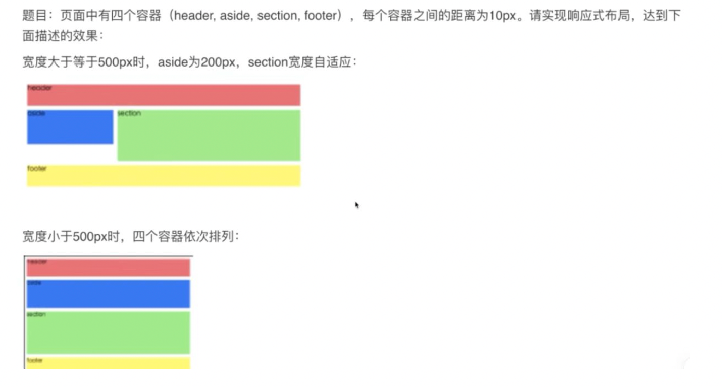
题目难点在于:中间部分(aside和section的高度未指定,但仍需要占满整个空白区域)
解决办法:position:fixed确定中间部分在页面的位置,aside指定宽高,section指定align-self:stretch;
代码:
1
2
3
4
5
6
7
8
9
10
11
12
13
14
15
16
17
18
19
20
21
22
23
24
25
26
27
28
29
30
31
32
33
34
35
36
37
38
39
40
41
42
43
44
45
46
47
48
49
50
51
52
53
54
55
56
57
58
59
60
61
62
63
64
65
66
67
68
69
70
71
72
73
74
75
76
77
78
79
| <!DOCTYPE html>
<html lang="en">
<head>
<meta charset="UTF-8">
<meta http-equiv="X-UA-Compatible" content="IE=edge">
<meta name="viewport" content="width=device-width, initial-scale=1.0">
<title>Baidu's CSS</title>
</head>
<body>
<header>header</header>
<div class="container">
<div class="aside">aside</div>
<div class="section">section</div>
</div>
<footer>footer</footer>
<style>
*{
margin: 0;
padding: 0;
width: 100%;
}
header{
height: 100px;
background-color: red;
}
footer{
position: fixed;
bottom:0;
width: 100%;
height: 100px;
background-color: yellow;
}
@media screen and (min-width:500px) {
.container{
position: fixed;
top:110px;
bottom: 110px;
display: flex;
}
.aside{
width: 200px;
height: 200px;
background-color: blue;
margin-right: 10px;
}
.section{
flex: 1;
align-self: stretch;
background-color: green;
}
}
@media screen and (max-width:500px) {
.container{
position: fixed;
top:110px;
bottom: 110px;
display: flex;
flex-direction: column;
}
.aside{
width: 100%;
height: 200px;
background-color: blue;
margin-bottom: 10px;
}
.section{
flex: 1;
align-self: stretch;
background-color: green;
}
}
</style>
</body>
</html>
|